Moveet
A brand built around the session, not the record. Moveet is a social app for beach and outdoor sport: someone posts a surf, a run or a match, and other people show up. We built its identity from the first brief to a brand book that lives online: mark, colour and type, photography, 24 sport icons, the core app screens and the brand site.
Client
Moveet
Ismael Benotmane, founder
Role
Lobos Design: brand identity from the first brief to the brand book and brand site
- Timeline
- July – October 2026
- Deliverables
- Concept territories
- Mark and wordmark
- Colour and type system
- Photography direction
- Iconography
- App screens
- Brand book
- Brand site
Results
- Every candidate mark was judged at app-icon size first
- 24 px
- Rounds of marks fell at that test before the pinwheel
- 5
- Rays in the mark; a seventh, one per sport, was tried and dropped
- 6
Move and meet, in one word
It started on a padel court. The match was the brief.
Four people on a court who would not have played without something that found them: that was the brief before anyone wrote it. Most sports apps track what you did alone; Moveet is built around the session, the run, the surf or the match that happens because someone posted it and someone else showed up. The name took a month of back and forth over five candidates before we kept the one that says it all: move and meet, pushed into one word. On the map Strava, Komoot, Playtomic and Meetup each hold a corner. Moveet takes the empty one, social and playful rather than solo and measured.
Move + Meet
The name is two words pushed together, because the product is two things happening at once. You go out to surf, to run, to play padel. You come back having met someone.
ActiveWarmSocialConfident
Warm, not loud. Energetic without being aggressive, premium without being corporate.
We are
- Outdoor, in daylight
- Social before competitive
- Photography first
- Built around the session
We are not
- Indoor, gym based
- Performance tracking
- Red or orange led
- About the lone athlete
Six rays, one centre
Three territories, five rounds of rejected marks, one pinwheel chosen on a call.
We opened with three territories, each with a brief, a moodboard and a palette: a hand carved sun for the beach ritual, two cut out figures meeting in motion, an athlete glyph. One rule judged them all: every mark is tested at 24 px first, because if it dies small, it dies. Five rounds fell at that test. Ismael kept pointing at the sun, then asked for seven blades, one per sport. On the 23 July call we chose the pinwheel and kept it at six: a seventh ray would have been forced, and the number of sports should never draw a logo. The wordmark is cut from a modified Unbounded, with the double e as its signature: move and meet, side by side.
A star, a flower, a spinning sun, a surf fin. Deliberately more than one thing. The app’s loader is this same mark, turning.
The wordmark is drawn lettering, with the double e as its signature. Never typed.
Judged at 24 px before anything else, because that is where people meet it: a home screen and a notification.
Unbounded Bold, typed
Moveet, drawn
- Raised vertex
- Cuts on the E only
Two layers that never mix
Blue and terracotta first. Then yellow won the room.
The first pair was blue and terracotta. It lasted two weeks: in the 7 August meeting red and orange went, too aggressive and too close to Strava, and gradients went with them. Deep blue and a warm yellow became the brand, on an off-white ground, in a fixed 60, 30, 10 split. Sport got its own layer: four families, Slide, Explore, Play and Get Fit, each with a soft tone that lives only on chips and tags. Play started orange and moved to coral the day it fought the yellow. On any colour the text is deep blue, never white. Unbounded speaks above 34 px; Manrope, picked over Inter, explains everything else.
Colour
- Explore
- Play
- Get Fit
Unbounded speaks.
Manrope explains.
Padel tomorrow morning. All levels.
Aa Bb Cc 0123456789
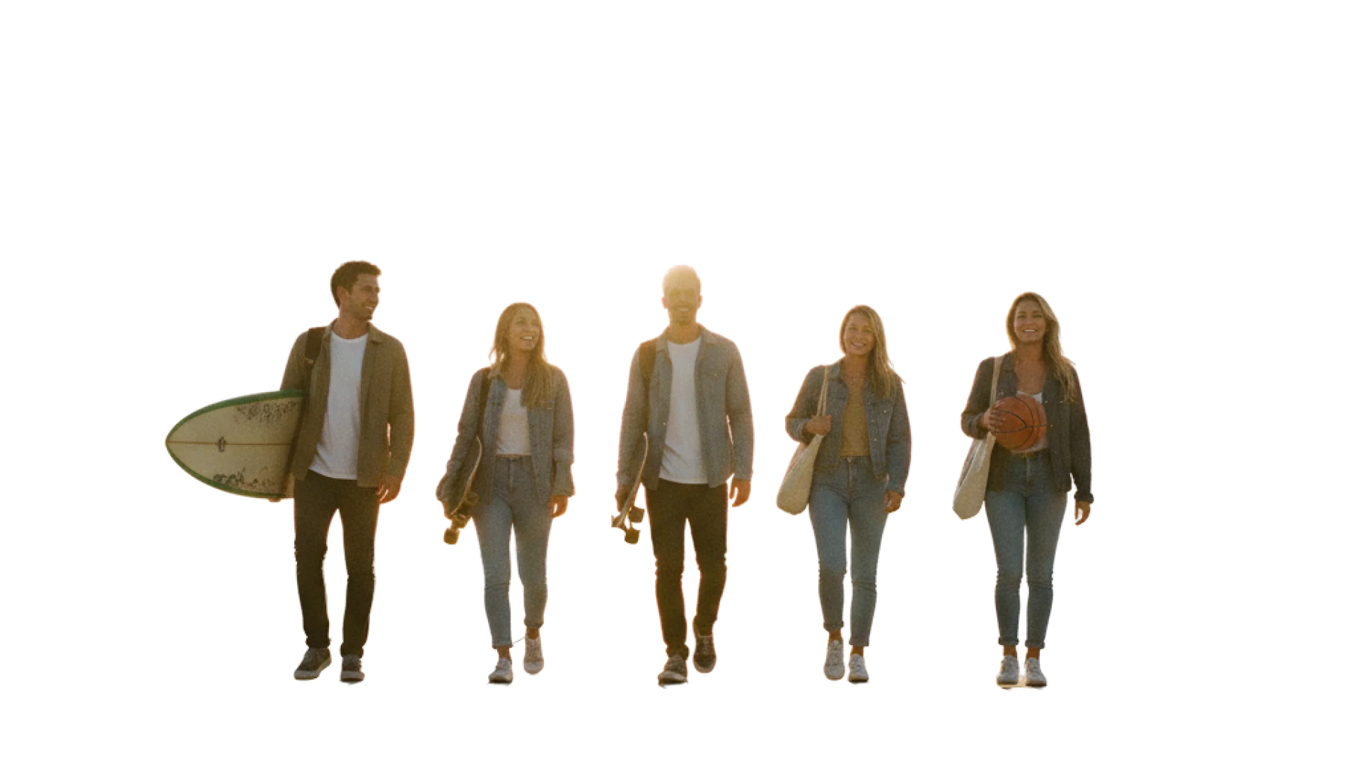
Real people, objects and rings
Two photo treatments, 24 objects and one pattern.
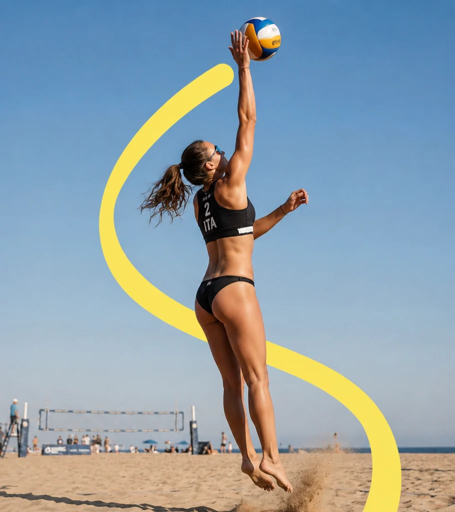
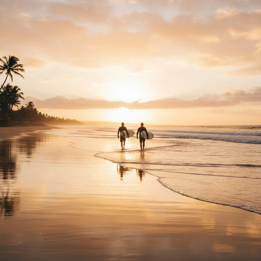
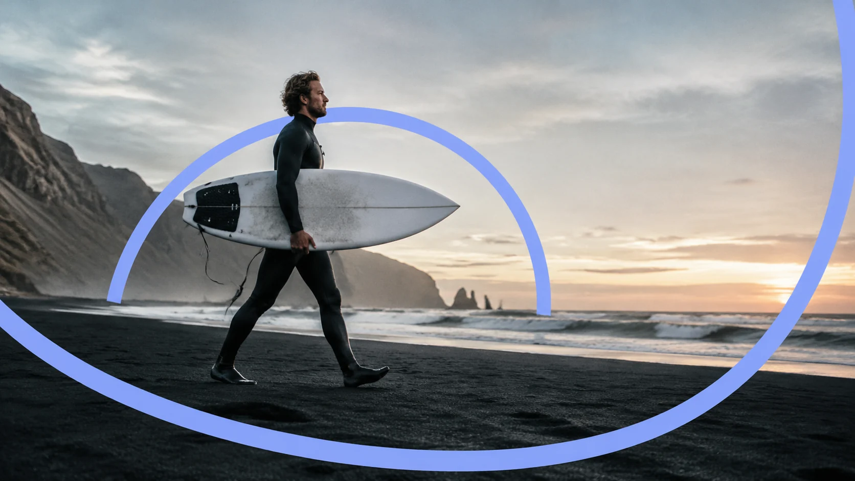
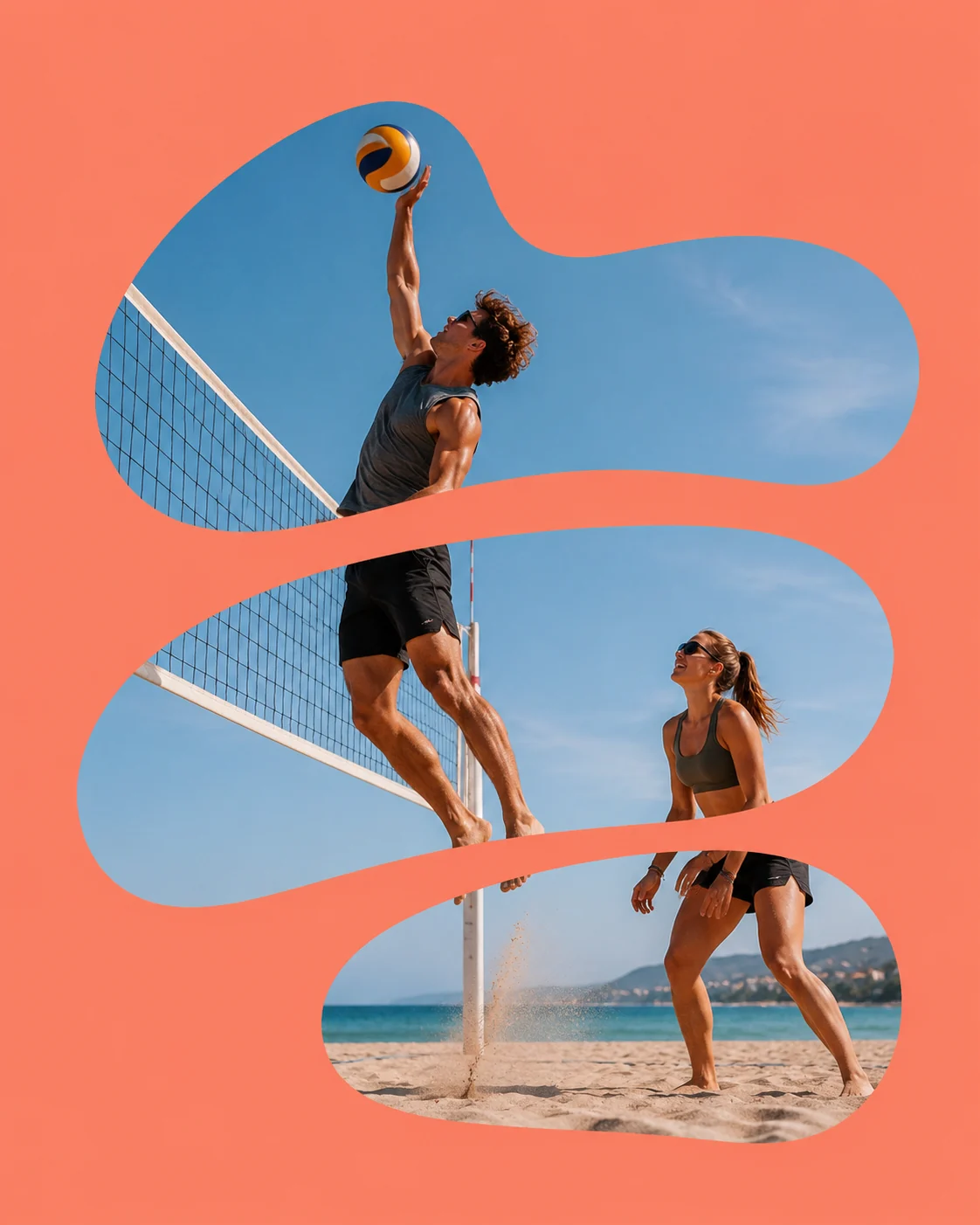
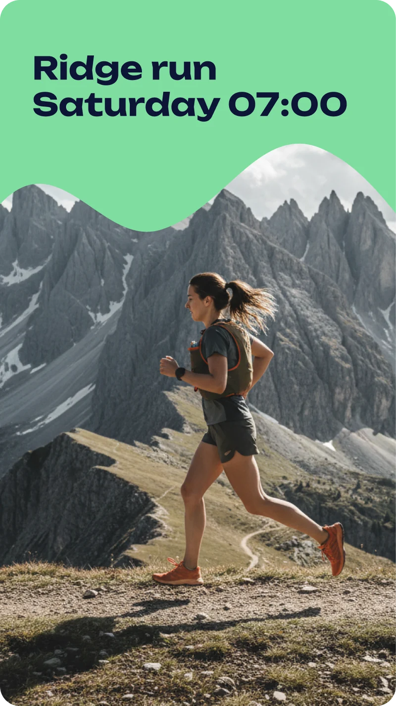
The first image tests had the right light and none of the brand. The fix was a three layer build: the photo, a flat band of colour, then the athlete cut out and laid back on top, so the ribbon runs behind the body and in front of the ground, the route made visible. Where a date has to sit on the picture, the colour mask cuts the athlete onto a category tone instead. The sport icons took three attempts before they stopped reading as a bread loaf or a robot face; the final 24 name a sport by its object, never a body. Orbit, rings struck from one corner, is the only pattern. It pulses outward and never rotates.
Sunday 07:10
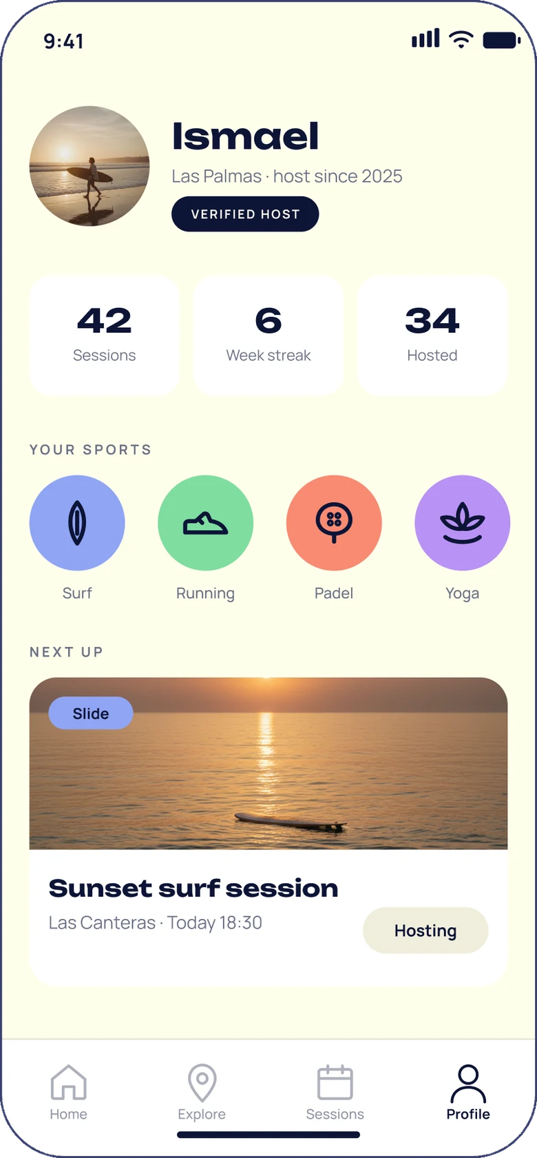
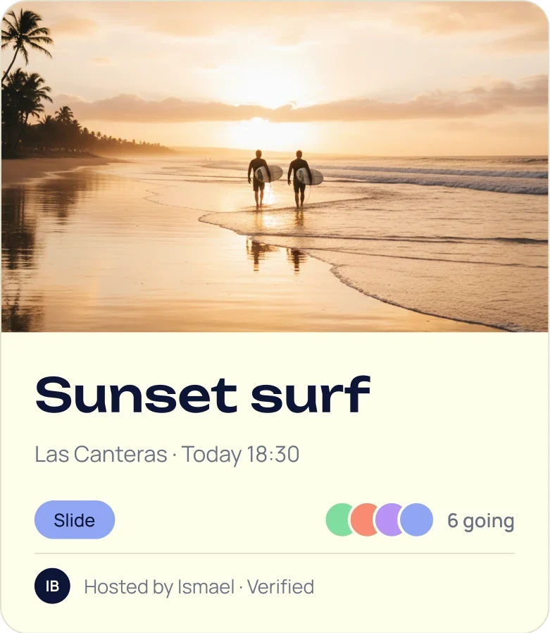
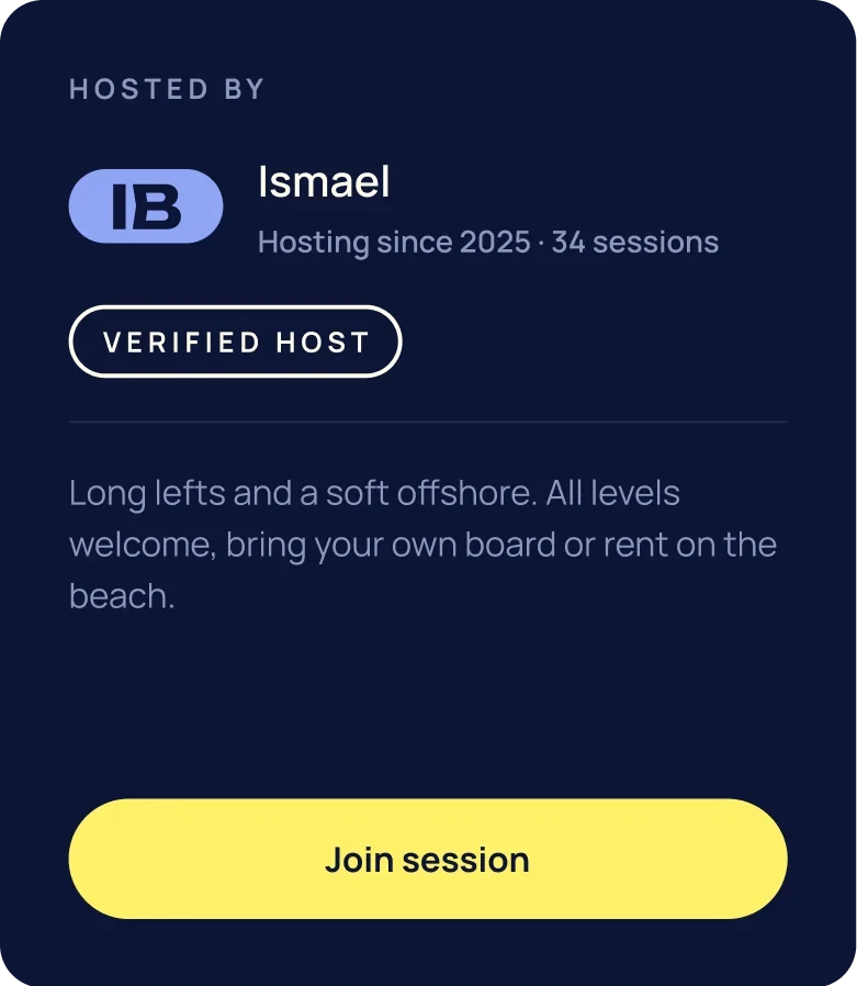
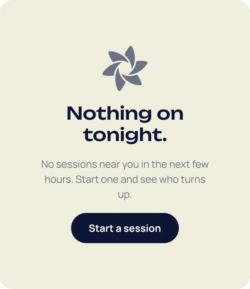
Everything happens on a card
Ismael was already coding. The system had to arrive as screens.
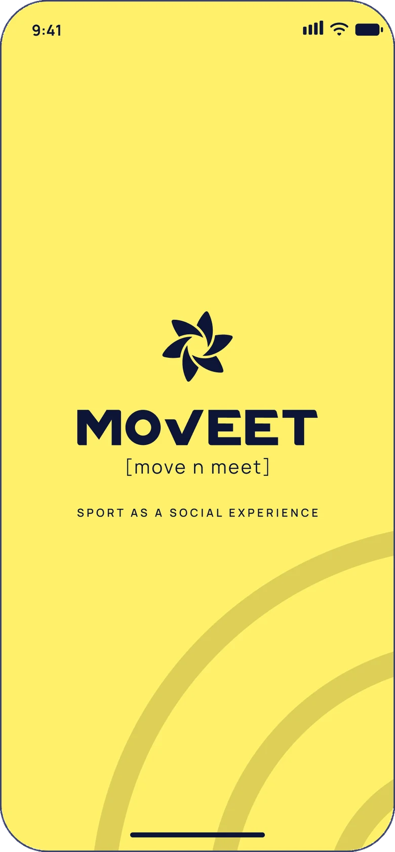
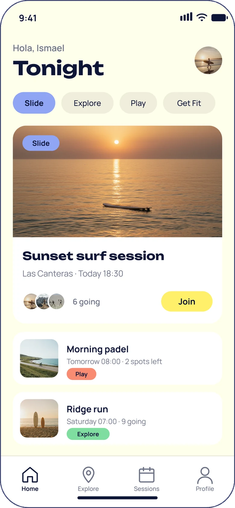
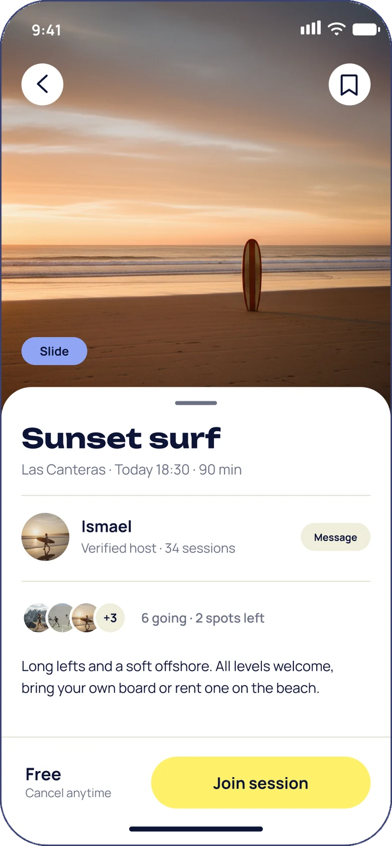
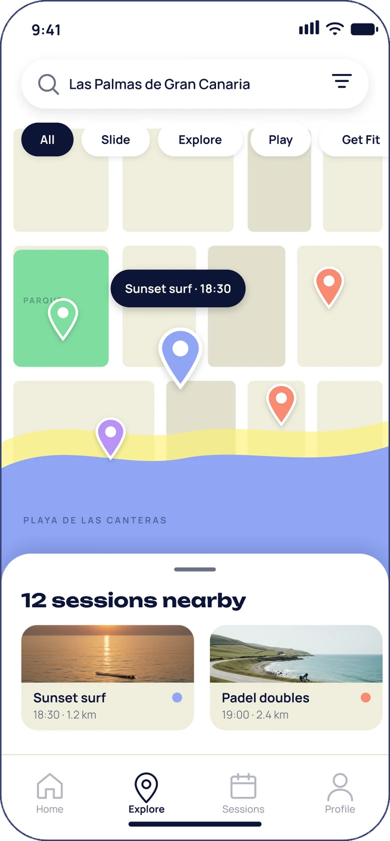
Ismael was building the app while we designed it, so every decision had to land in a screen he could use the next day. The product runs on one object, the session card: a photo, a category tag, a place, a time and how many are going. An early version put the app on deep blue and we dropped it; the ground is warm off-white so people’s photos pop and the brand stays clear of the dark territory Strava owns. Yellow appears twice per screen at most, for the primary action and the active state. The empty state never apologises: it offers the next session.
In the world
A 52-page book, a brand site and the same rules everywhere.
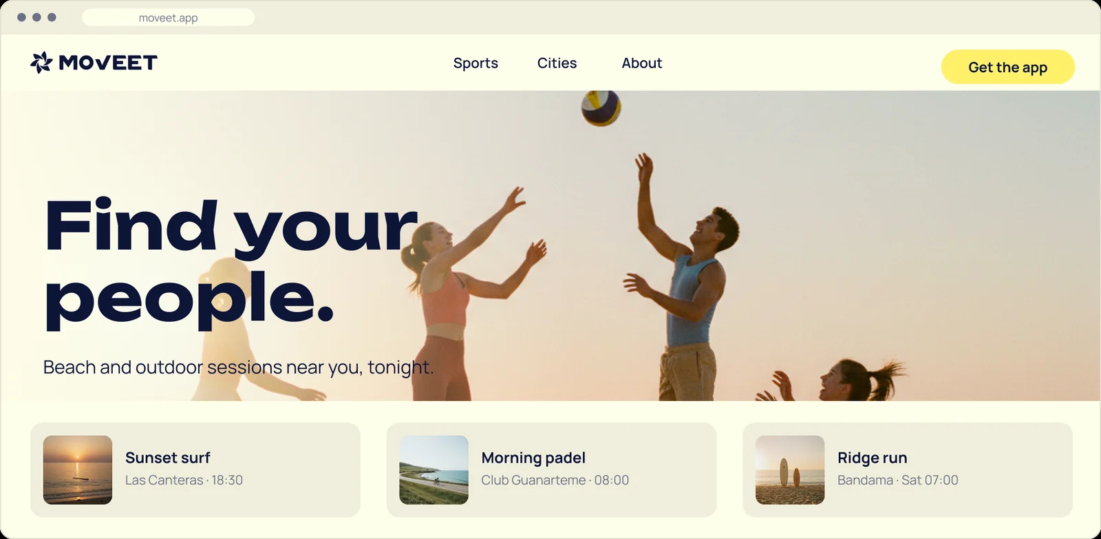
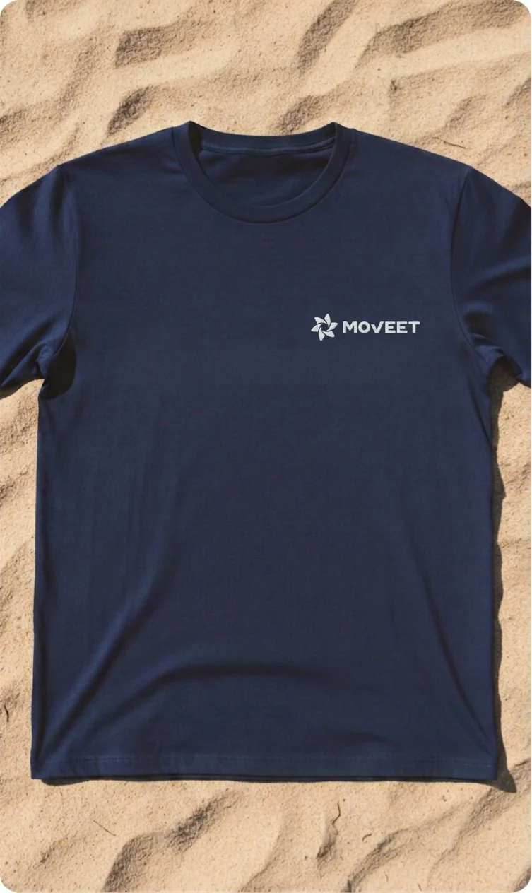
The brand book went from a 119-page plan to 52 pages that leave nothing out, and the brand site puts every file, token and rule one click away, with copyable values and live contrast checks. Out in the world the rules hold: one screen to explain the website, two photo languages across five social templates, deep blue and yellow as a two-spot system in print, single-colour merchandise where the lockup sits on deep blue or off-white, never on a photograph. The voice keeps the same restraint: Moveet writes like a friend texting you about tonight.
Browse the live brand site (opens in a new tab)
“Surf at Las Teresitas. 18:30. Six going.”
How we deliver a brand
The brand book is a website
Every Lobos brand ships as its own site, not a PDF that gets lost in a folder. Logo files, colour tokens, type, imagery and motion rules sit one link away, always up to date, for the founder, the developer and whoever designs the next poster. Moveet’s is live.
See Moveet’s brand guidelines (opens in a new tab)Brand identity, app screens, brand book and brand site by Lobos Design for Moveet.
Want something like this?
Tell us what you have in mind. We reply within one to two working days.
Next project
ANS · Agentic News Signals
