heu!
You already pay for the benefits. You just forget them. heu! is a free app in the UAE that matches the cards in your wallet to the discounts they unlock. We led its redesign end to end, from the first screen to the design system underneath.

Stop forgetting the benefits you already have.
Banks · Memberships · Boarding passes
Client
heu!
UAE and Saudi Arabia
Role
Lobos Design: UX/UI design lead for the end-to-end redesign
- Timeline
- 2026 · 14 weeks and counting
- Deliverables
- Audit
- UX
- UI
- Design system
- 3D direction
- Dark mode
- Developer handoff
- Platforms
- iOS
- Android
Where it is now
In build, launching in 2026
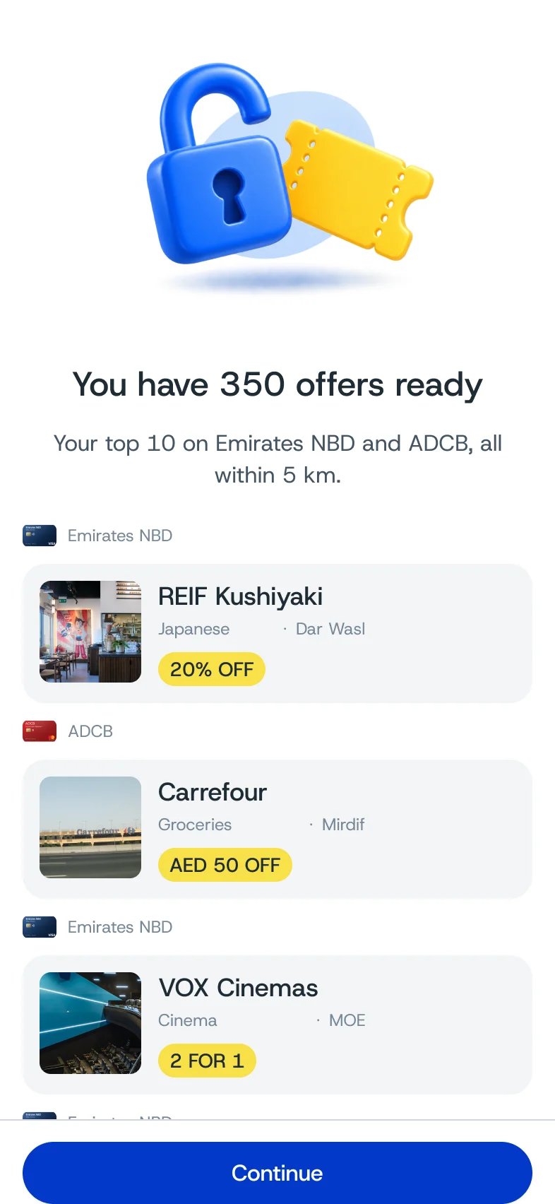
heu!’s engineer is building the redesign screen by screen, and it launches in 2026. It was designed to bring people back: a first card and a first search in the first session, more sign-ups, more return visits. The numbers go here once they exist.
Product audit · UX strategy · Information architecture · UI design · Design system · 3D direction · Dark mode · Handoff
Results
- Screens and states, each with a dark twin
- 100+
- Custom components in the design system
- 42
- Cities across two countries in onboarding
- 12
- Weeks from kickoff to this page
- 14
Put order in a mess
heu! had the data. The app made it hard to find.
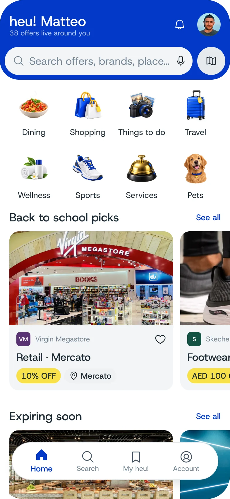
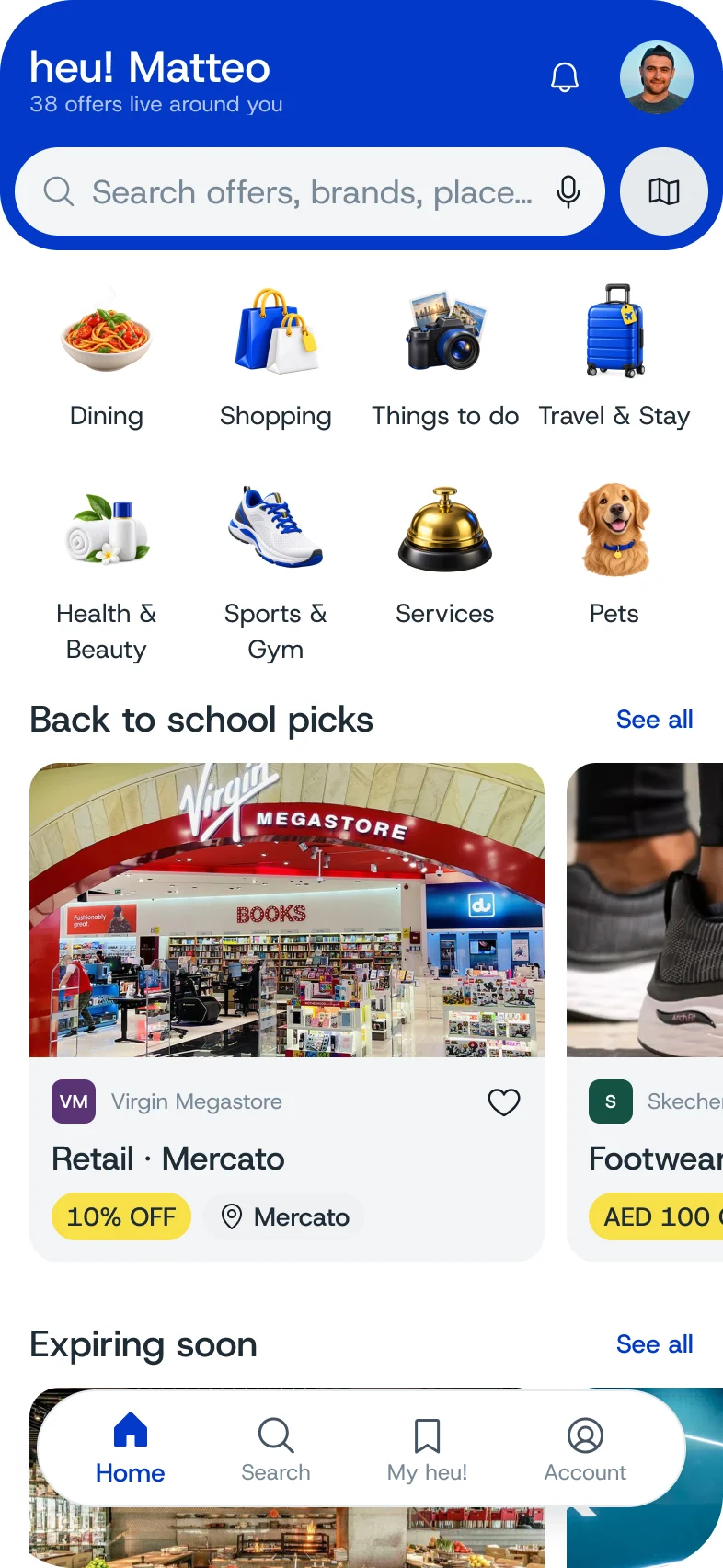
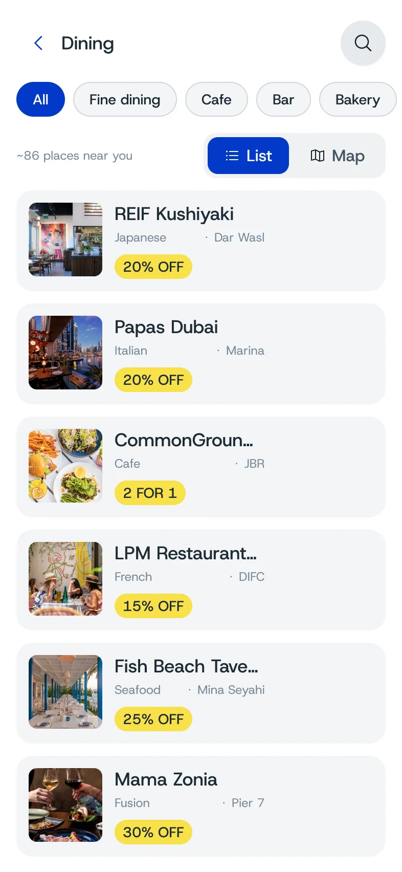
Most people in the Emirates carry a bank card or two that come with dining, spa and cinema discounts, and almost nobody remembers which card does what. heu! had already done the hard work: around 10,000 bank offers, plus about a thousand more that unlock with an Emirates or Etihad boarding pass. Yet people downloaded the app, looked around once and left. We started with the live product, walking every flow, then went through the backend with the engineer field by field. The data was complete. The home screen categories were not based on it. We rebuilt the taxonomy from the database itself: eight categories and fifteen place attributes. Lifestyle became Things to do, since around 70% of those places are leisure.
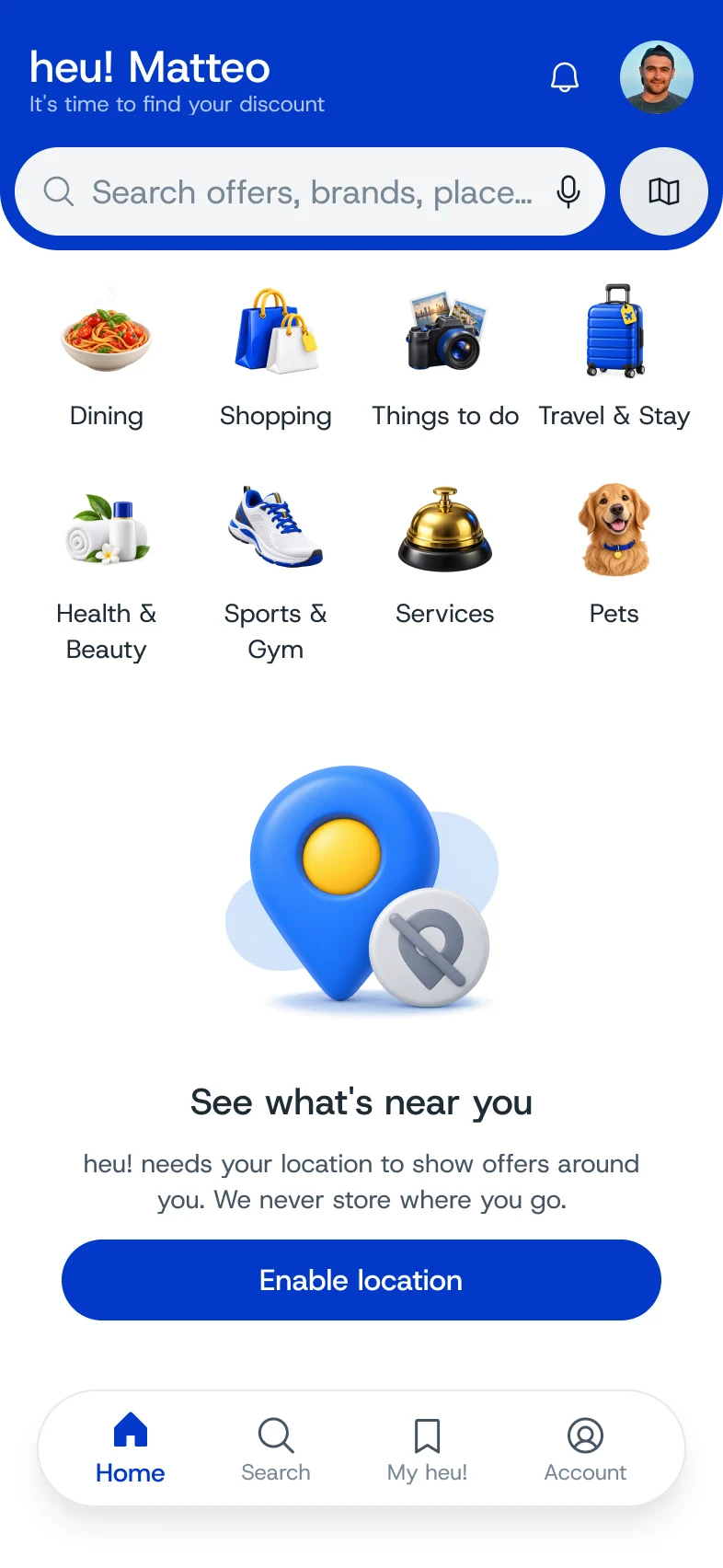
Eight categories, taken straight from the database.
- Dining
- Shopping
- Things to do
- Travel & Stay
- Health & Beauty
- Sports & Gym
- Services
- Pets






In the database
10,000
bank offers, matched to the cards people already carry
+1,000
tourist offers unlocked by an Emirates or Etihad boarding pass

- All
- Cinema
- Museums
- Zoo
- Aquarium
- Galleries
- Parks
- Gardens
- Tours
- Kids clubs
- Bowling
- Go-karting
- Ski
- Water parks
- Marinas
- Observation decks
- Outdoor
- Outdoor seating
- Rooftop
- Live music
- Pet friendly
- Family friendly
- Romantic
- Sea view
- Lively
- Upscale
- Casual
- Brunch
- Shisha
- Ladies only
- Open late
Onboarding built around your wallet
An earlier survey had cost the app users. This time every answer is a tap.
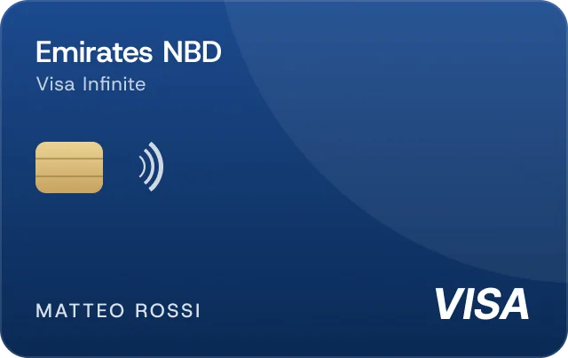
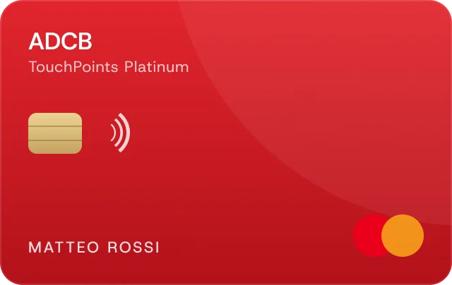
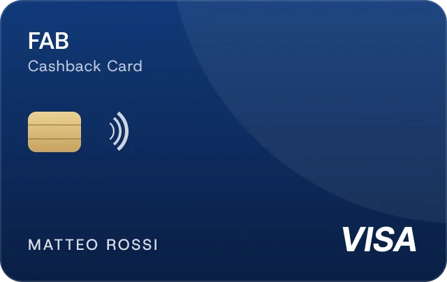
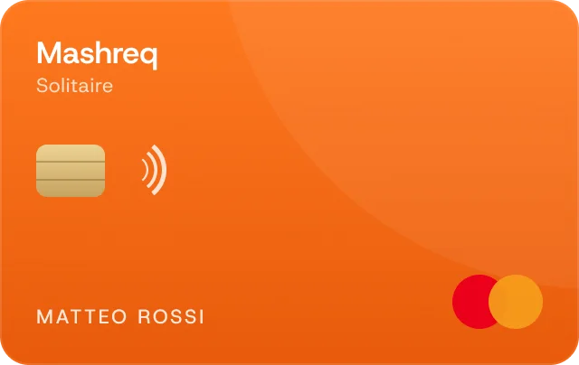
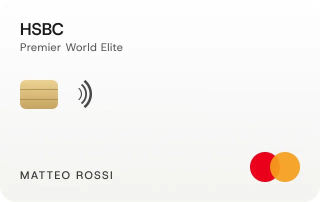
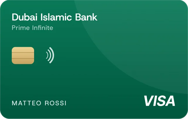
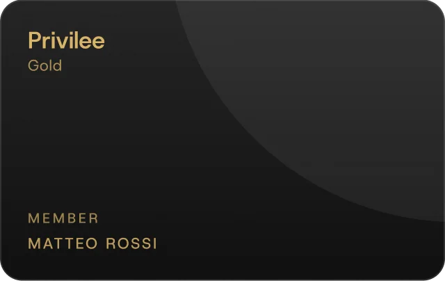
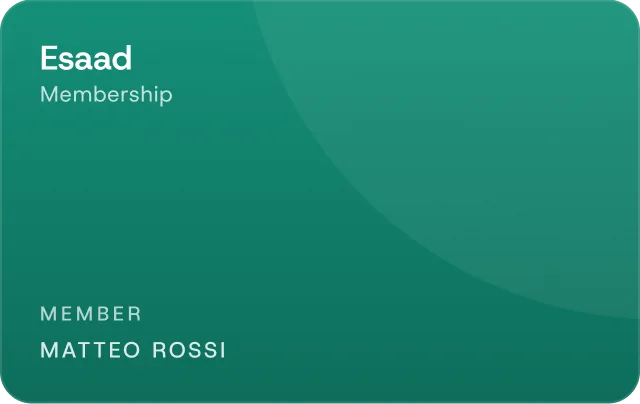
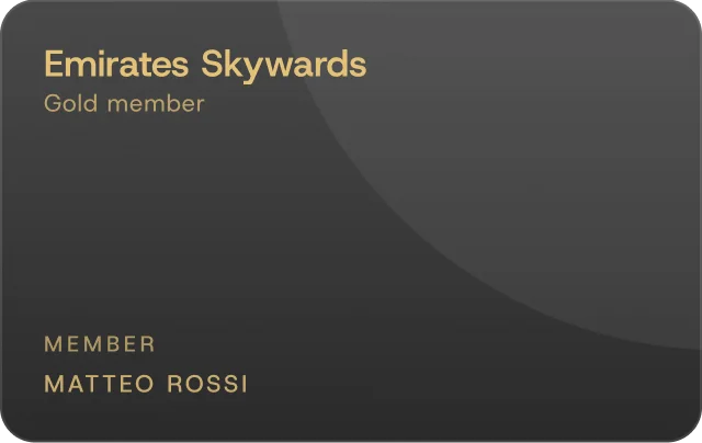
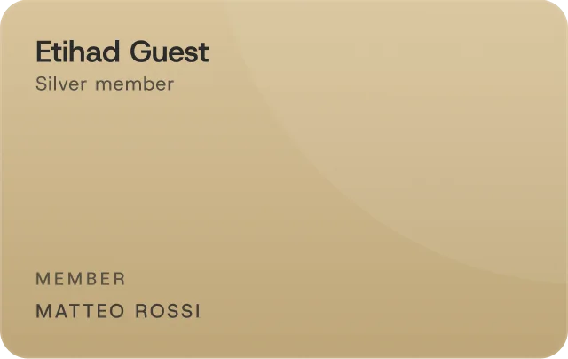
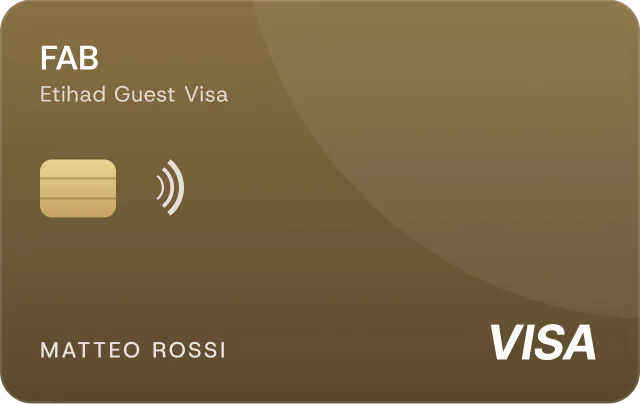
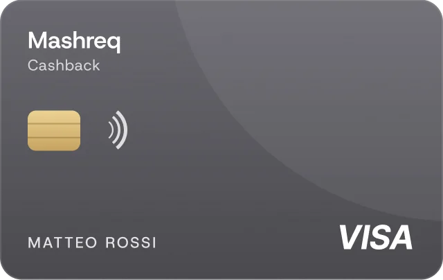
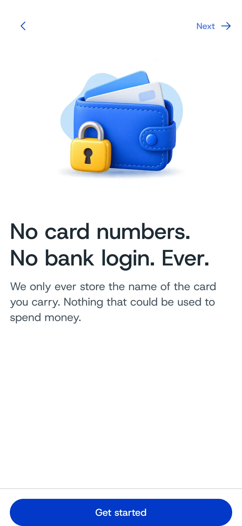
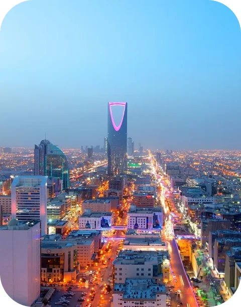
A previous version asked new users to fill in a profiling survey, and the drop-off was measurable. So we treated onboarding as the riskiest part of the product. It now takes four steps: city, cards, preferences, account. The card step does the real work. Banks, memberships and boarding passes sit in their own tabs, and a counter at the bottom shows how many offers each pick unlocks. The button works from the first card, even while the count is still loading. When the founders asked for Saudi Arabia, we checked where existing users actually live and added four cities. The flow ends on the user’s own top offers rather than a welcome screen.


Card motion study
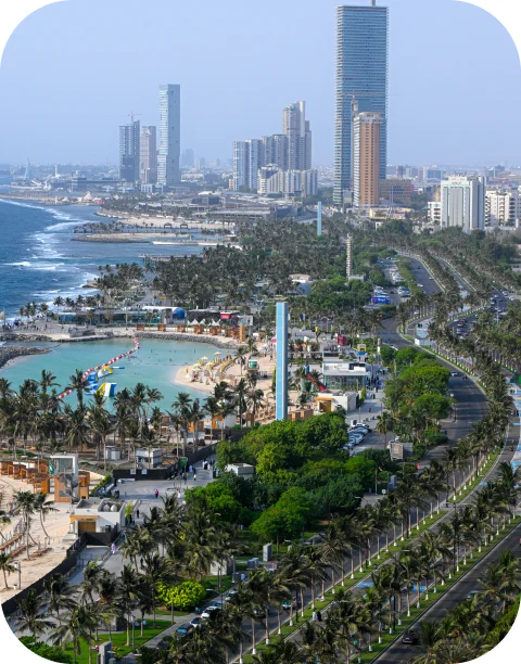
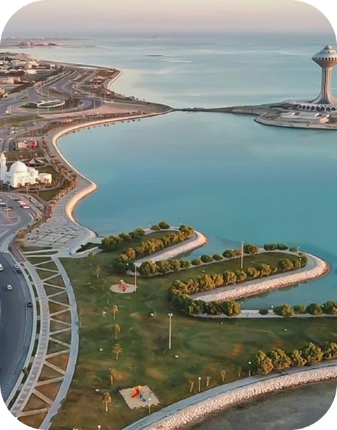
Saudi Arabia · added from where users live
- Riyadh
- Jeddah
- Dammam
Search is the front door
Ten thousand offers are too many to browse. People needed to be able to ask.
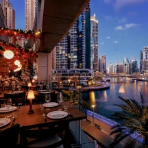
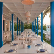
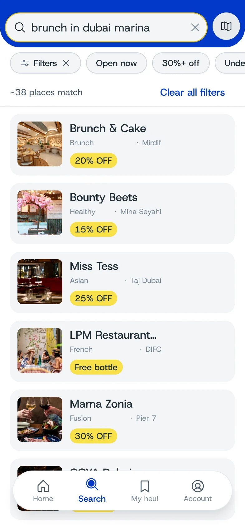
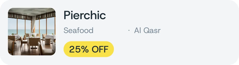
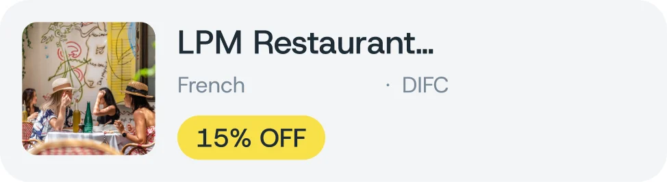
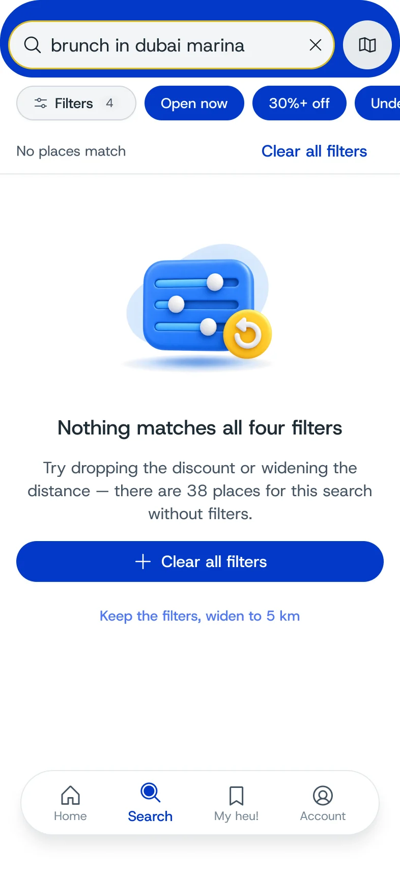
The home screen opens on a single search field that understands plain sentences, like brunch in Dubai Marina or a romantic restaurant for two with a sea view. Suggested and recent queries help when people don’t know where to start, and every result set can be filtered or opened on the map. We were deliberate about how the AI comes across. The app never calls it an assistant. It is called intelligent search and it behaves like search, because in a product about money, overpromising costs trust quickly. In the results, the discount is the first thing you read, then the place, then the card that unlocks it.
“a romantic restaurant for two with a sea view”
- CategoryDining
- StyleRomantic
- PlaceSea view
14places match, the biggest savings first

- A romantic restaurant for two with a sea view
- Somewhere for brunch this Friday
- A quiet cafe to work from nearby
- Family-friendly dinner under 200 AED
When the answer is no
The map shows less at first, and a dead end became a reason to add a card.
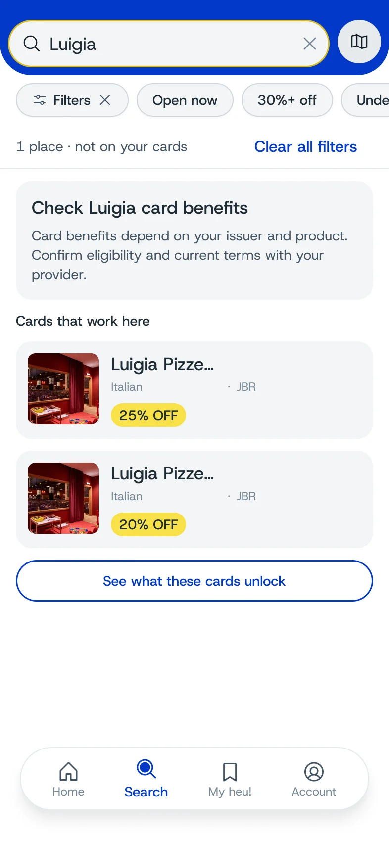
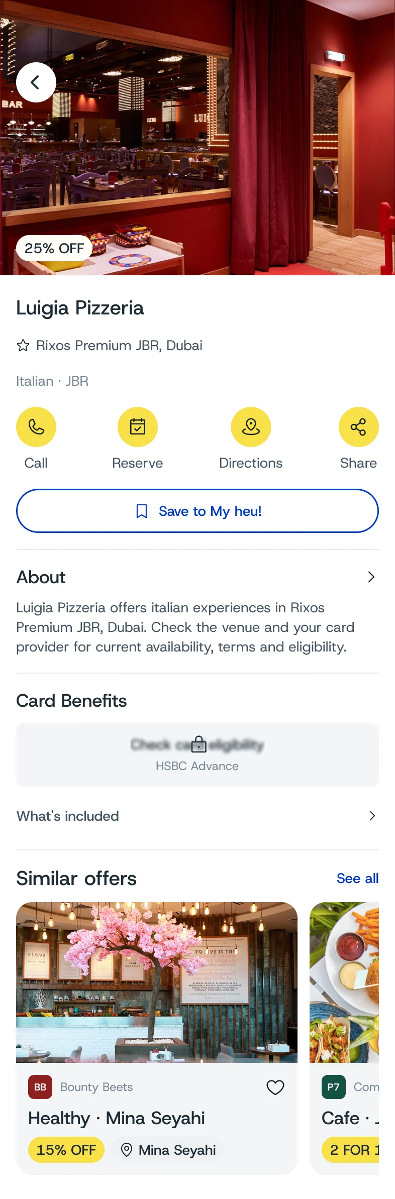
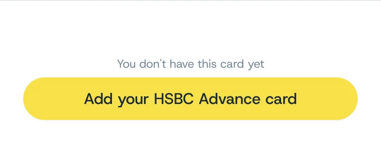
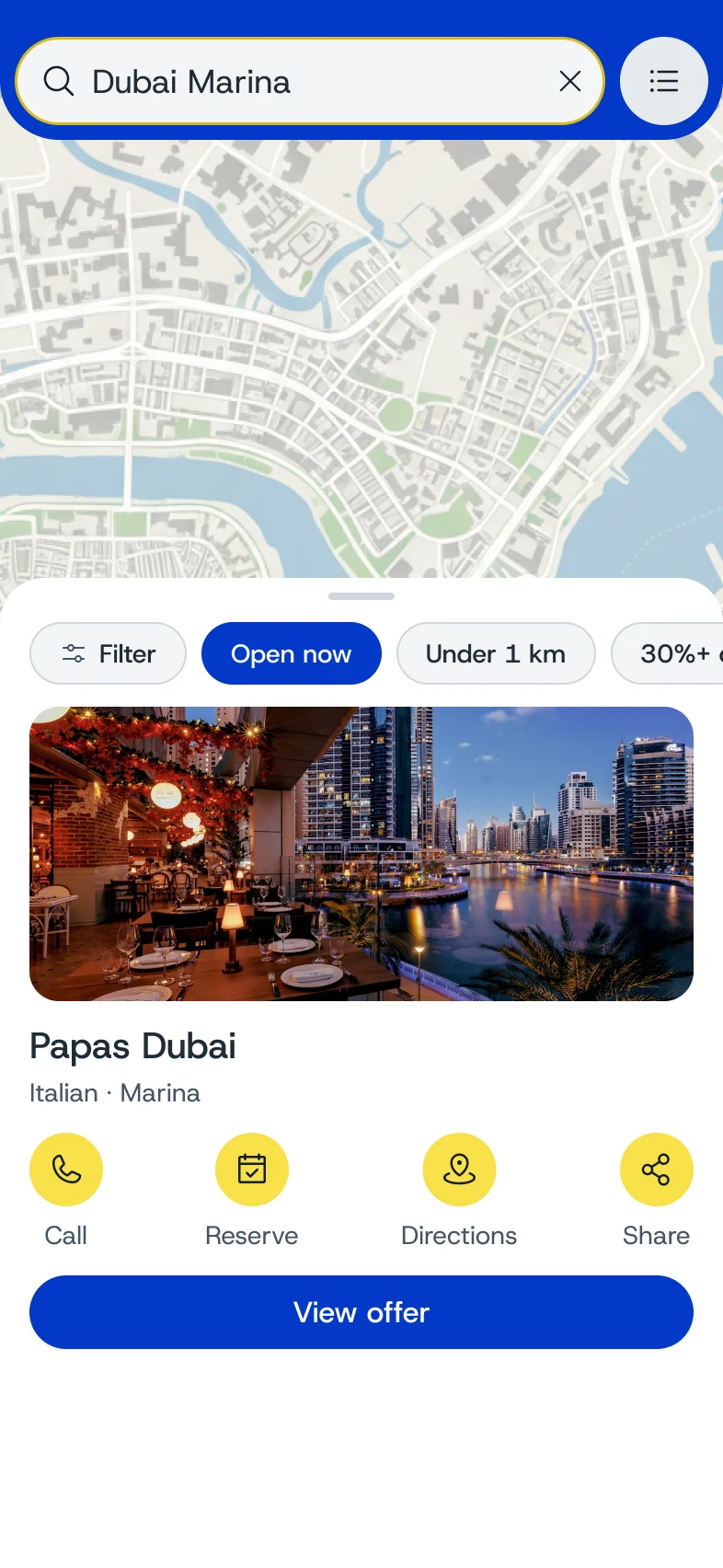
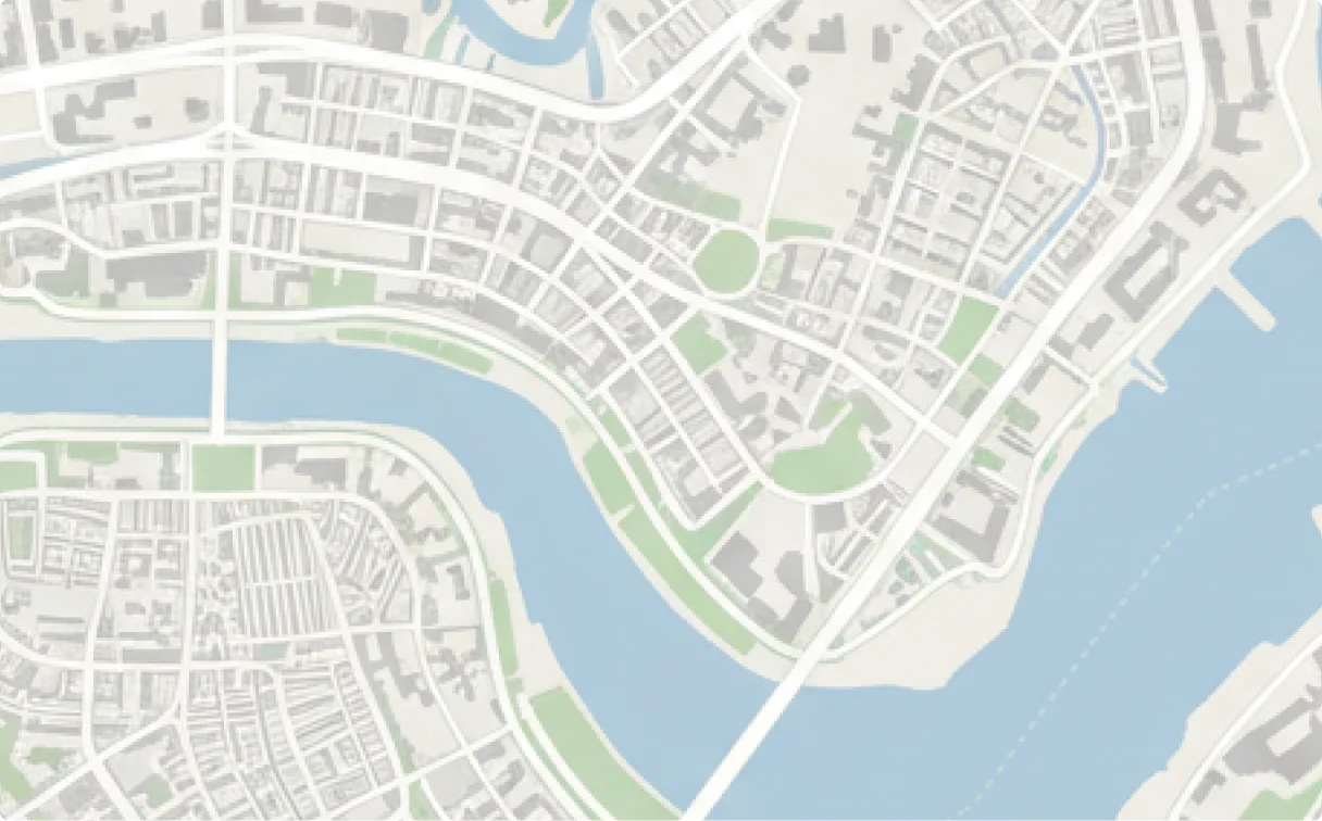
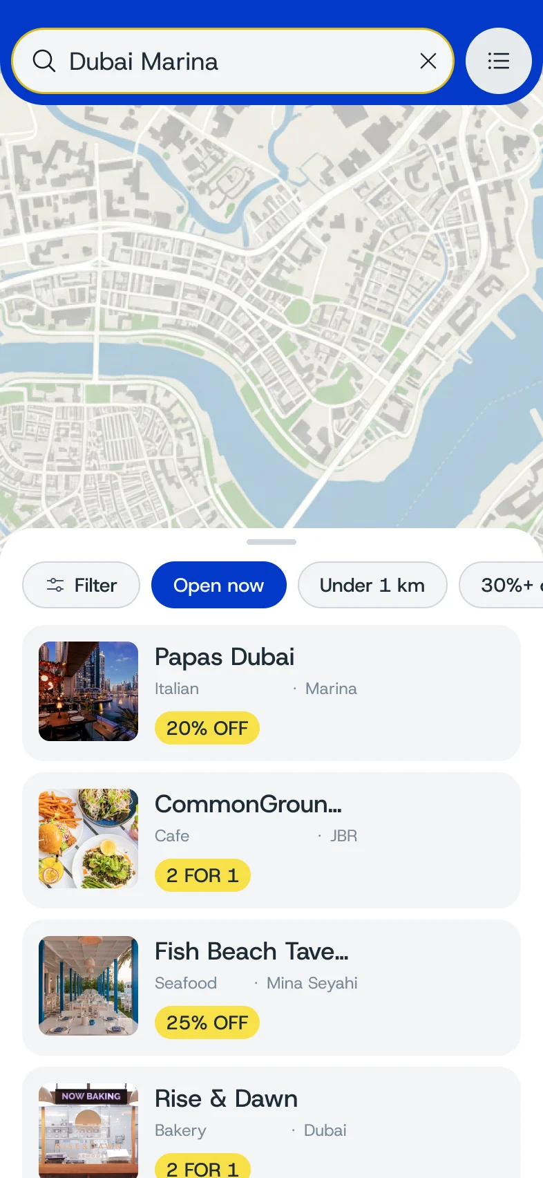
The old map dropped every pin at once. The new one opens close to where you are, lets you pick a category before anything appears, groups nearby places and keeps the list a swipe away. The flow we like most starts with a no. You search for a restaurant that none of your cards covers. Instead of an empty screen, heu! tells you which cards would unlock it, and the offer page ends with a single action: add that card. A missing benefit becomes the reason to grow the wallet, which is exactly the habit the business depends on.
Not on your cards. Here is the card that is.



A system, not a set of screens
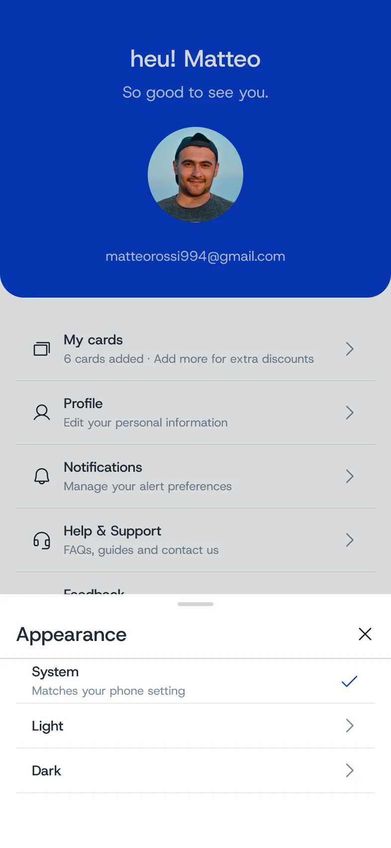
We kept the brand and rebuilt everything underneath it.
The brief mentioned a possible rebrand, and we advised against it. heu! had a wordmark people recognised and a confident blue and yellow palette, and the problems were in the product. The brand typeface stays for communication, and the interface uses a more legible one. The design system was built first and handed to the engineer early, so development could start while flows were still in design: 42 documented components on top of a UI kit, with every colour, spacing and radius bound to a variable. That is why dark mode, approved late in the project, was a mode switch rather than a redraw. Illustrations moved to 3D, with seasonal versions of every category icon.






- Blue#0446F1
- Yellow#F8E049
- Ink#151F27
- White#FFFFFF
Host Grotesk
Interface typeface, chosen for legibility at small sizes. The brand face stays for communication.
4 weights · Regular to Bold
The unglamorous screens
Edge cases decide whether an app feels finished.
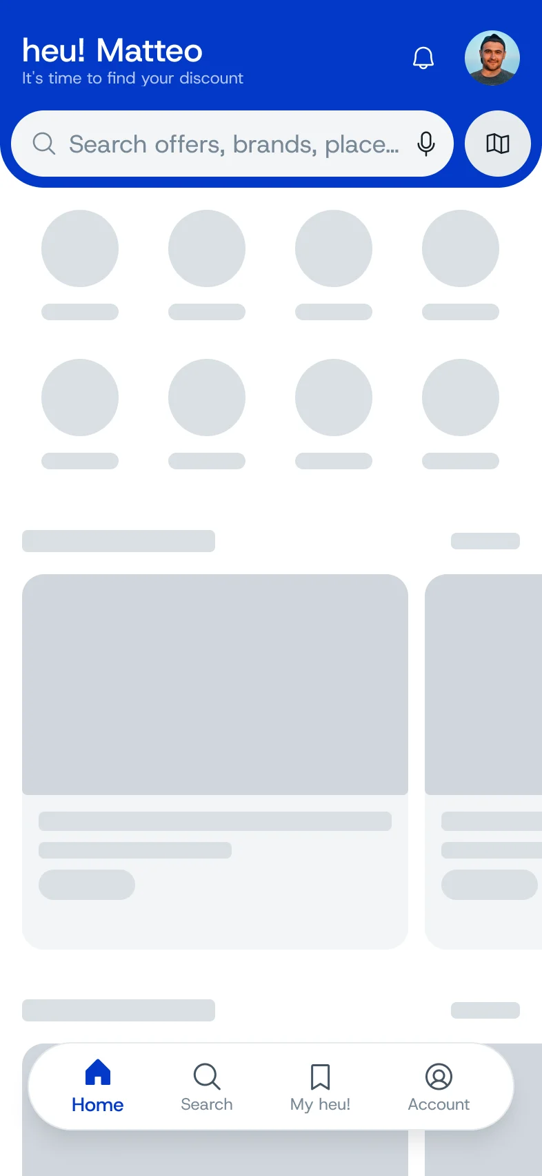
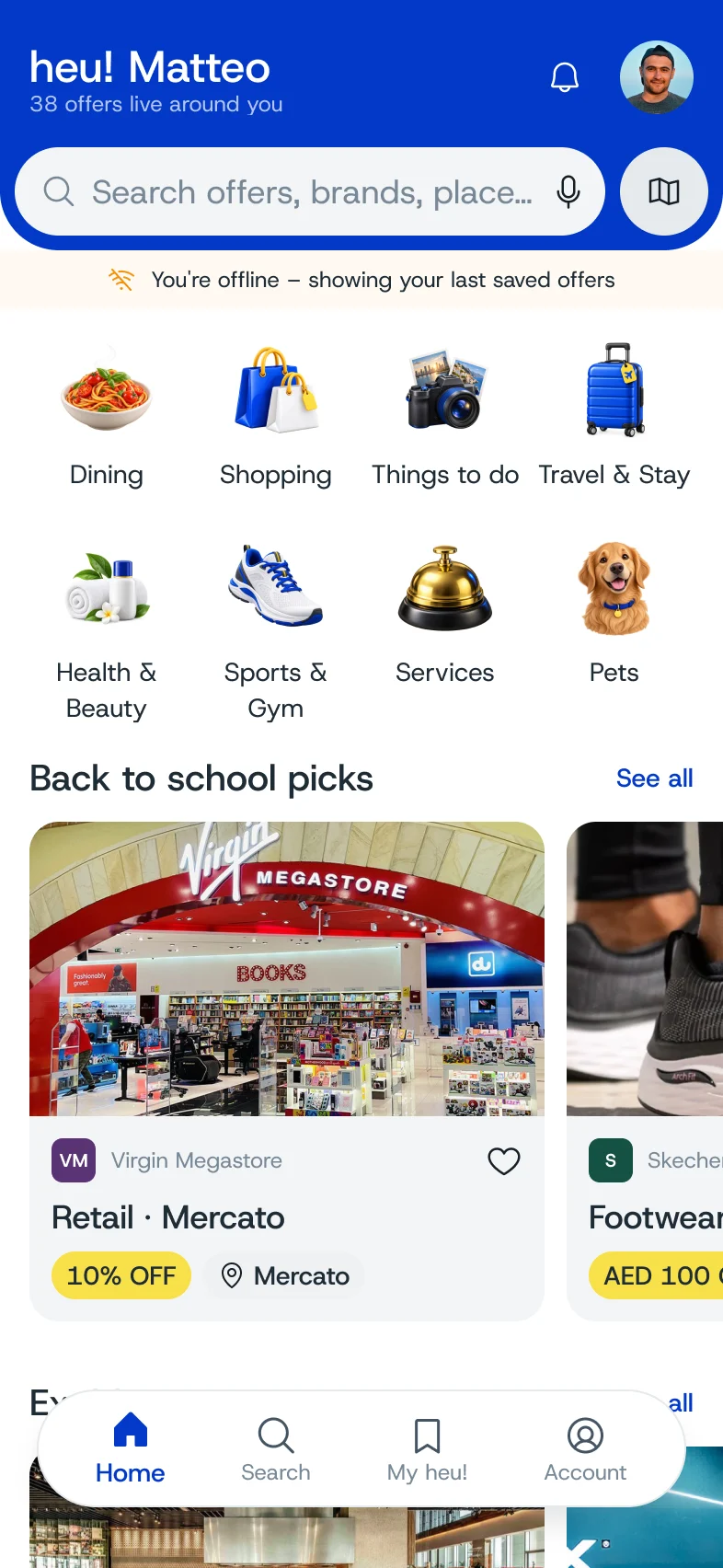
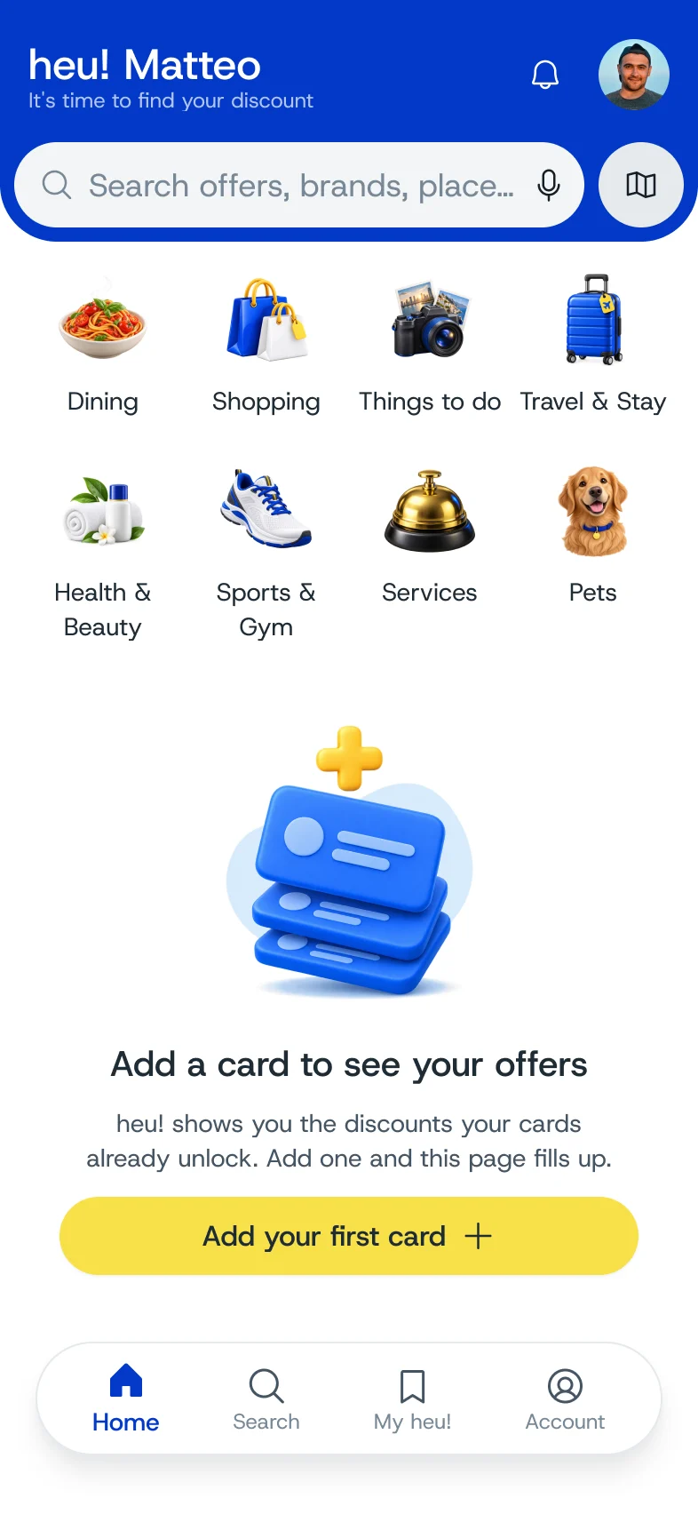
Existing users see one screen that explains what changed and are asked to set a new password, without going through onboarding again. Sign in covers eleven screens, including wrong credentials, too many attempts and an expired code, and none of them reveals whether an email is registered. Every list has a loading state, and location off, offline and no results each have their own screen. The engineer builds the app one to one from Figma, so we delivered it in closed blocks every two to three weeks, with notes under each screen, and checked every test build on a real device before sending the next.
- Loading
- Location off
- No results
- Offline
- No cards
What’s new in heu!
Three things moved. Nothing was lost.
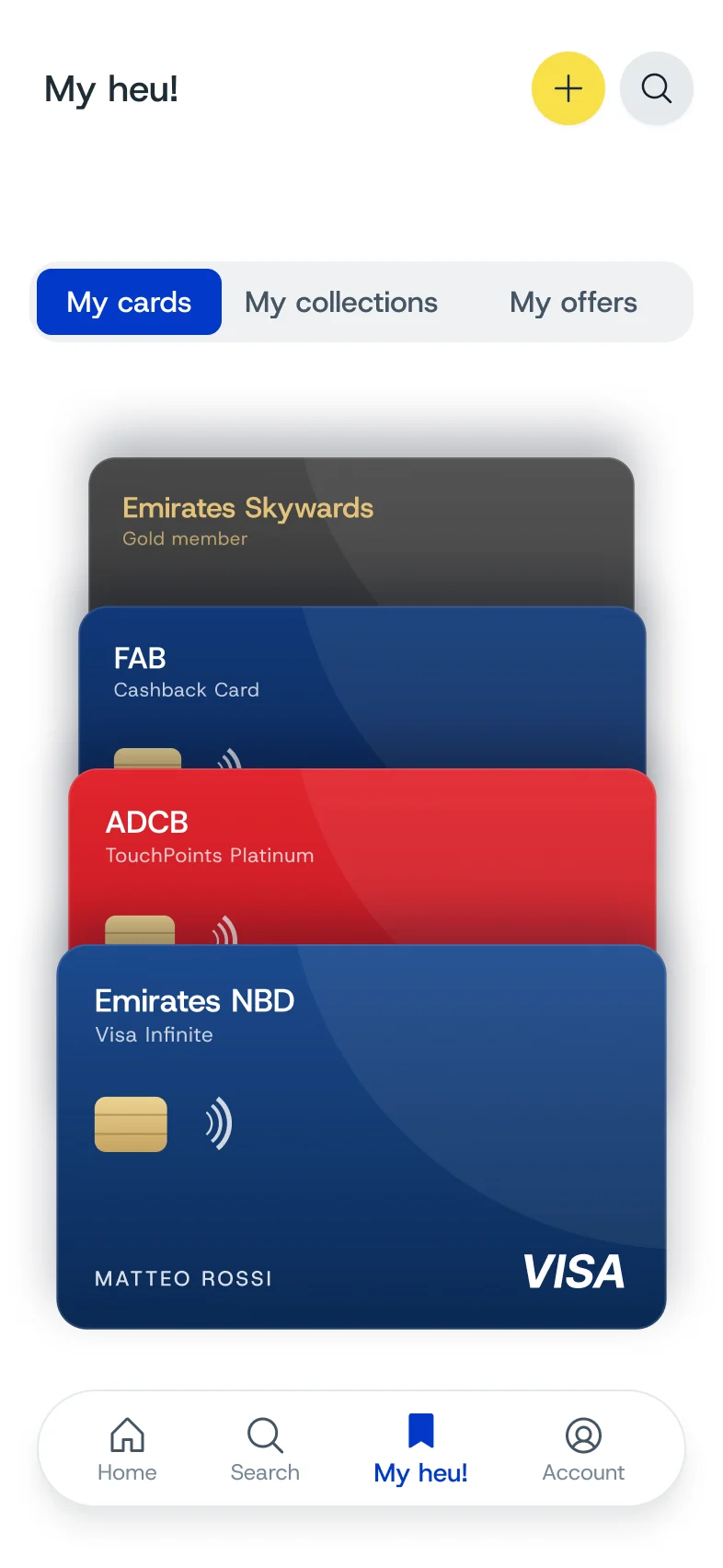
- Your cards live in FavouritesCards, collections and saved offers now sit together in one tab.
- Search understands youAsk in your own words, “romantic dinner, sea view”, and we find the offer.
- Picked for you, not for everyoneThe home feed ranks by the cards you carry and the places you like.



- 22 JunKickoff with the founders
- 3 JulBuild pipeline agreed with the engineer
- Jul – AugDesign system handed off first
- 15 SepFirst onboarding review on a device
- 28 SepDark mode approved
“Stop forgetting the benefits you already have.”
heu!’s core promise, kept through the whole redesign.
Redesign, UX/UI and design system by Lobos Design. Engineering by heu!’s own team.
Want something like this?
Tell us what you have in mind. We reply within one to two working days.
Next project
Orto va in città
