Bella Ciao Pizzeria
From one neighbourhood pizzeria to a two-location brand world: identity, interiors, print, campaigns, ordering and a website designed to move.



Client
Bella Ciao Pizzeria
Nice
Role
Lobos Design: brand, art direction and web, working directly with the founder
- Timeline
- 2021 → ongoing
- Deliverables
- Identity
- Interior graphics
- Website
- Online ordering
- Motion
Results
- Restaurant locations
- 1 → 2
- Ongoing design partnership
- Since 2021
- Brand support
- 360°
- Connected touchpoints
- 6
A language with appetite
The brand became a kit of parts that could stay recognisable without staying still.
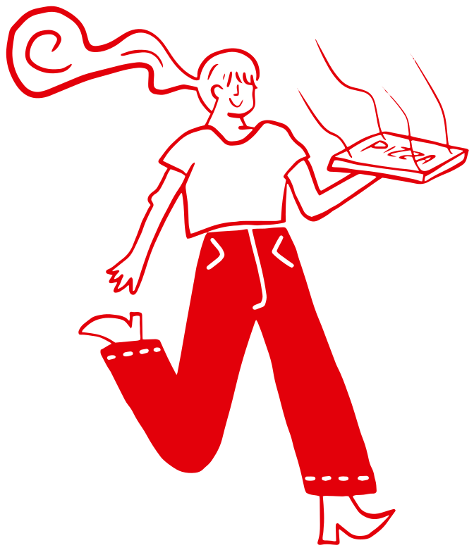
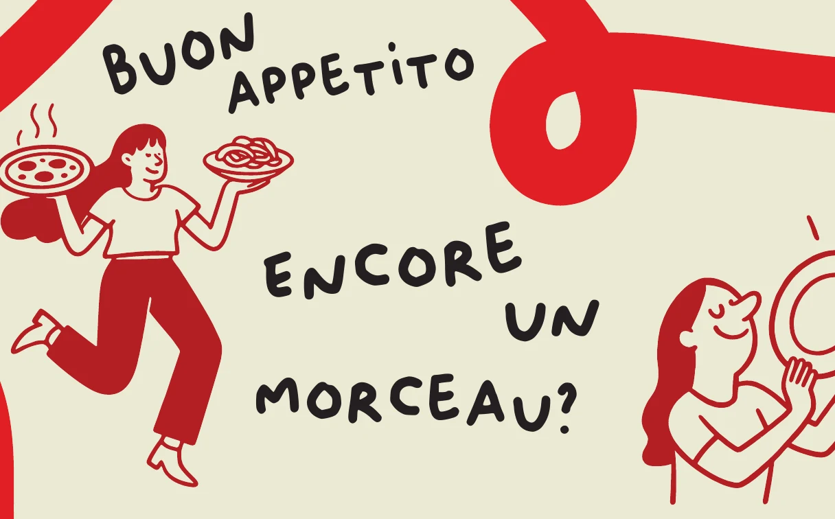
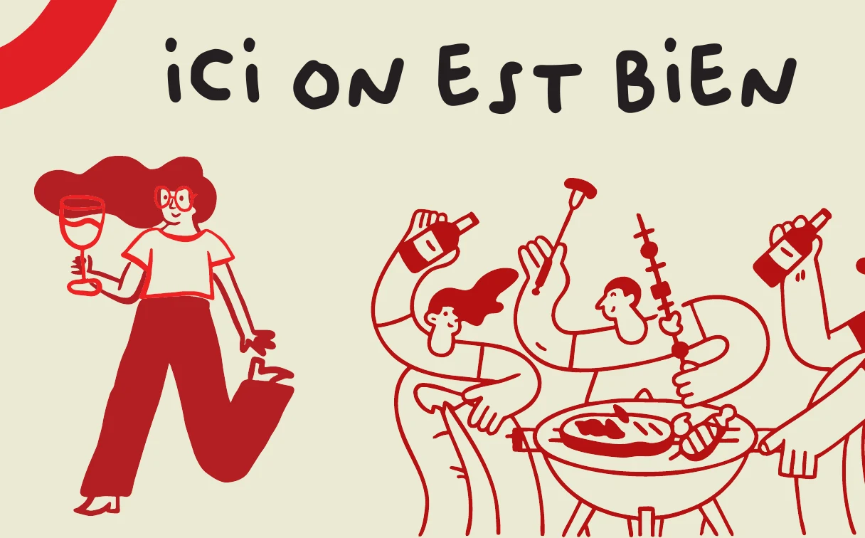
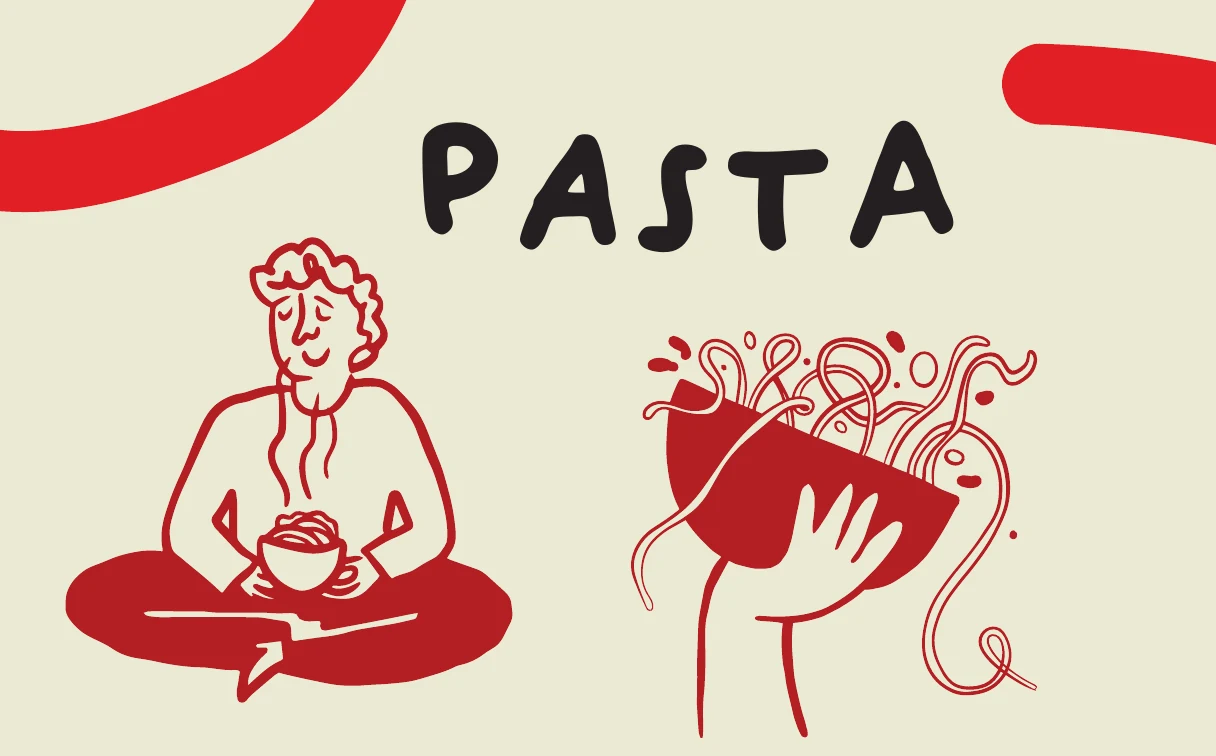
We drew the illustration collection by hand on iPad, building a family of characters, food forms and small gestures. Oliver brings the same handmade tone to the lettering, while Poppins keeps menus and practical information clear. Two reds sit alongside charcoal, grey, light grey and warm cream in the complete palette. The result is a flexible visual language: recognisable enough to hold the brand together, but varied enough for each menu, graphic or screen to have its own character.

Palette · by use
A little red goes a long way
Share of each colour across the September 2026 print set and the website.
- 86%Cream · #FFFFF5Paper, walls and screens
- 4%Light grey · #D4D4D4Rules and dividers
- 3%Red · #E20E1ELogo, headings and prices
- 3%Deep red · #B51212Panels and grounds
- 2%Grey · #707070Descriptions
- 2%Charcoal · #191919Text and line drawing


One identity, two neighbourhoods
Growth meant making the system more recognisable, not more generic.
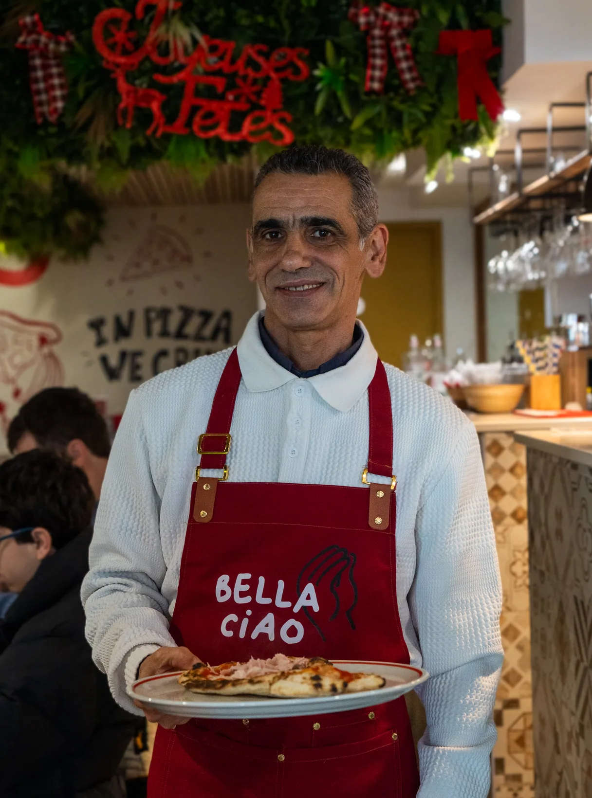
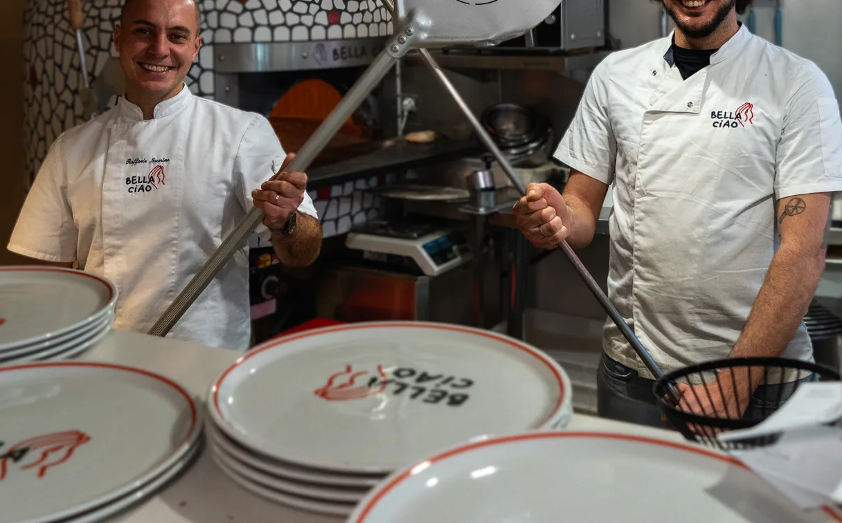
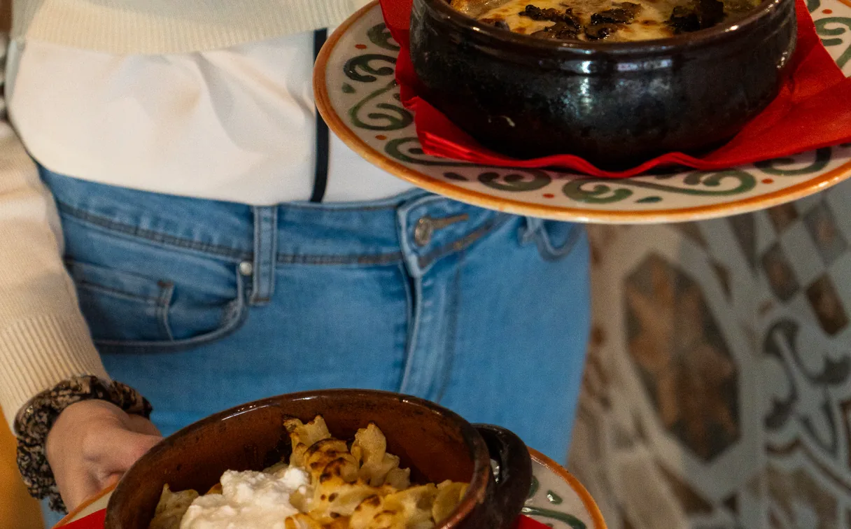
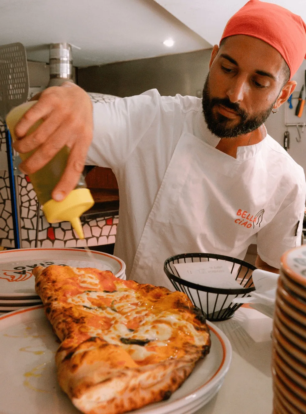
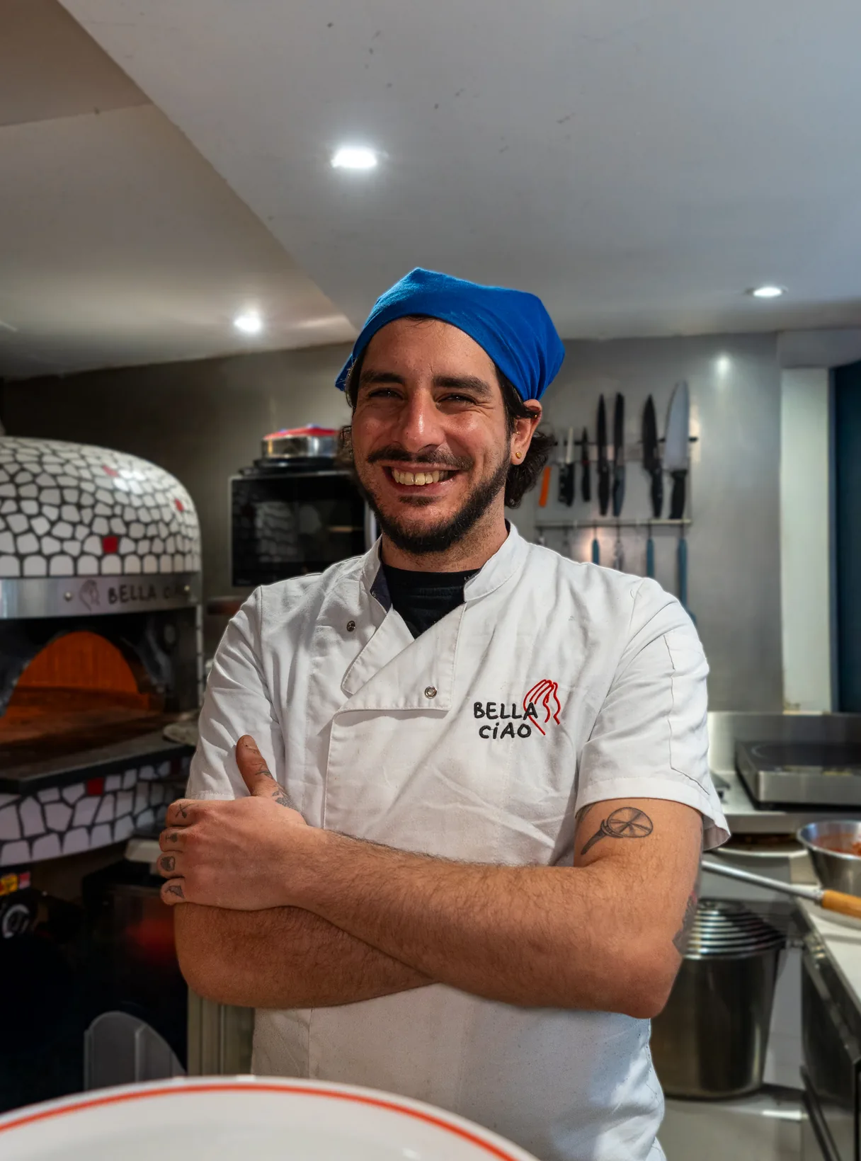
Bella Ciao started with one pizzeria on Avenue de la Californie. As the business grew into Vieux Nice, the identity had to stretch across a different room, audience and rhythm without becoming a franchise template. We kept the shared ingredients constant — red, warmth, irreverence and the craft of pizza — and let each location find its own atmosphere.
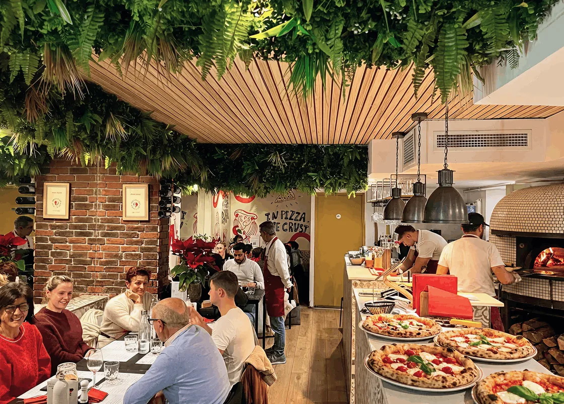
Californie
64 Avenue de la Californie 06200 Nice
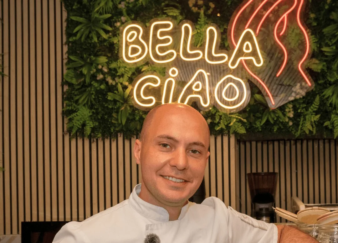
Vieux Nice
39 Rue de la Préfecture 06300 Nice
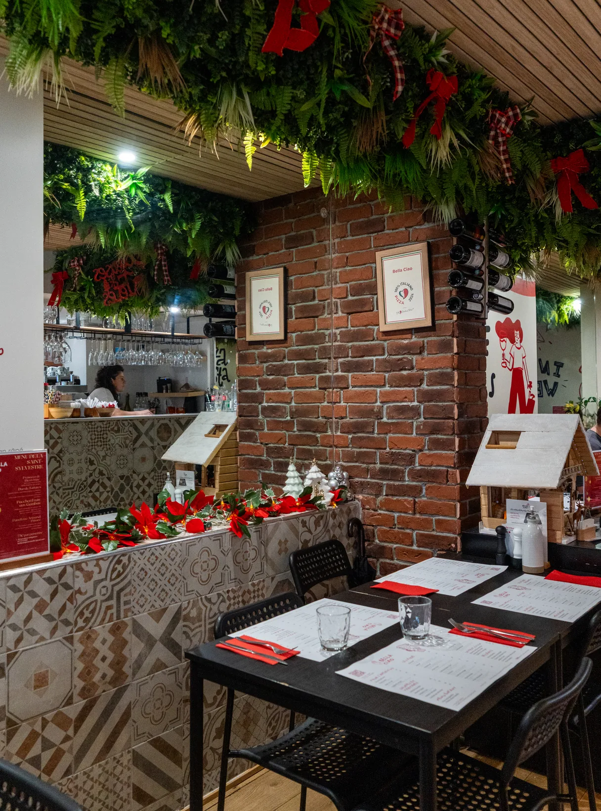
1 → 2
The same brand DNA, expressed across two locations.
The website, rebuilt with the business
Different phases, one brand — each version answered a new business moment.
We took the digital experience through an initial launch, online ordering and a complete redesign for two locations. The newest system carries the restaurant’s energy into the browser with large handwritten type, image-led horizontal movement, looping craft footage and playful location-card hovers. The motion is not decoration: it makes the brand feel as alive online as it does in the room.







Print, made for everyday use
Print was not support material. It was another place for the brand to perform.
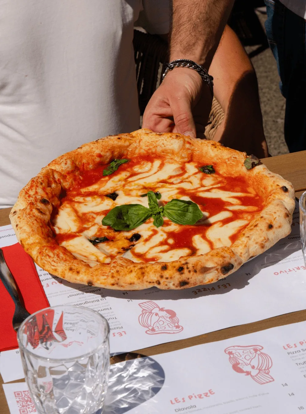
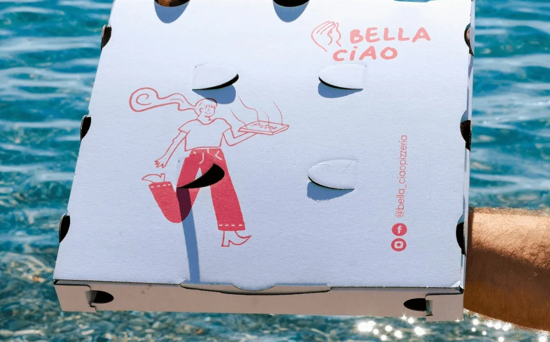
Our September 2026 print set brings the identity into the restaurants’ everyday use: full menus, drinks lists, placemats and takeaway pieces. The illustrations remain the expressive thread, while clear Poppins typography makes a dense offer easier to read. The takeaway cover and the pizza box pair the logo with the hand-drawn pizza server. At room scale, the same drawings run along the dining-room walls of Vieux Nice.


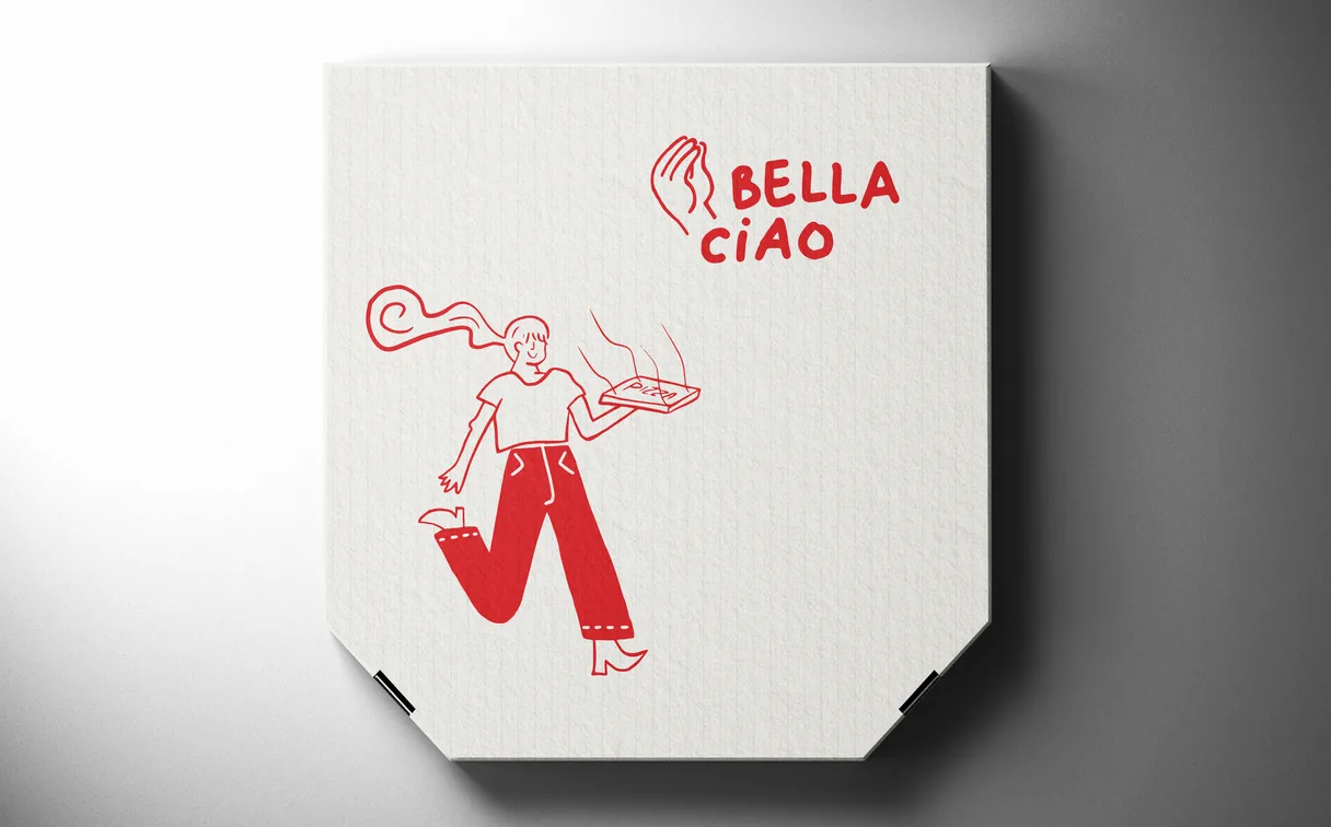
Identity, illustration, interior graphics, print, website and motion by Lobos Design, in an ongoing partnership with Bella Ciao Pizzeria since 2021.
Want something like this?
Tell us what you have in mind. We reply within one to two working days.
Next project
DIBS Parking
